 MCF User Guide
Layout blocks
Layout blocks shape how a page looks. Use them for large banners at the top of a page, for side-by-side columns, for long content split into tabs, and for slideshows and picture grids.
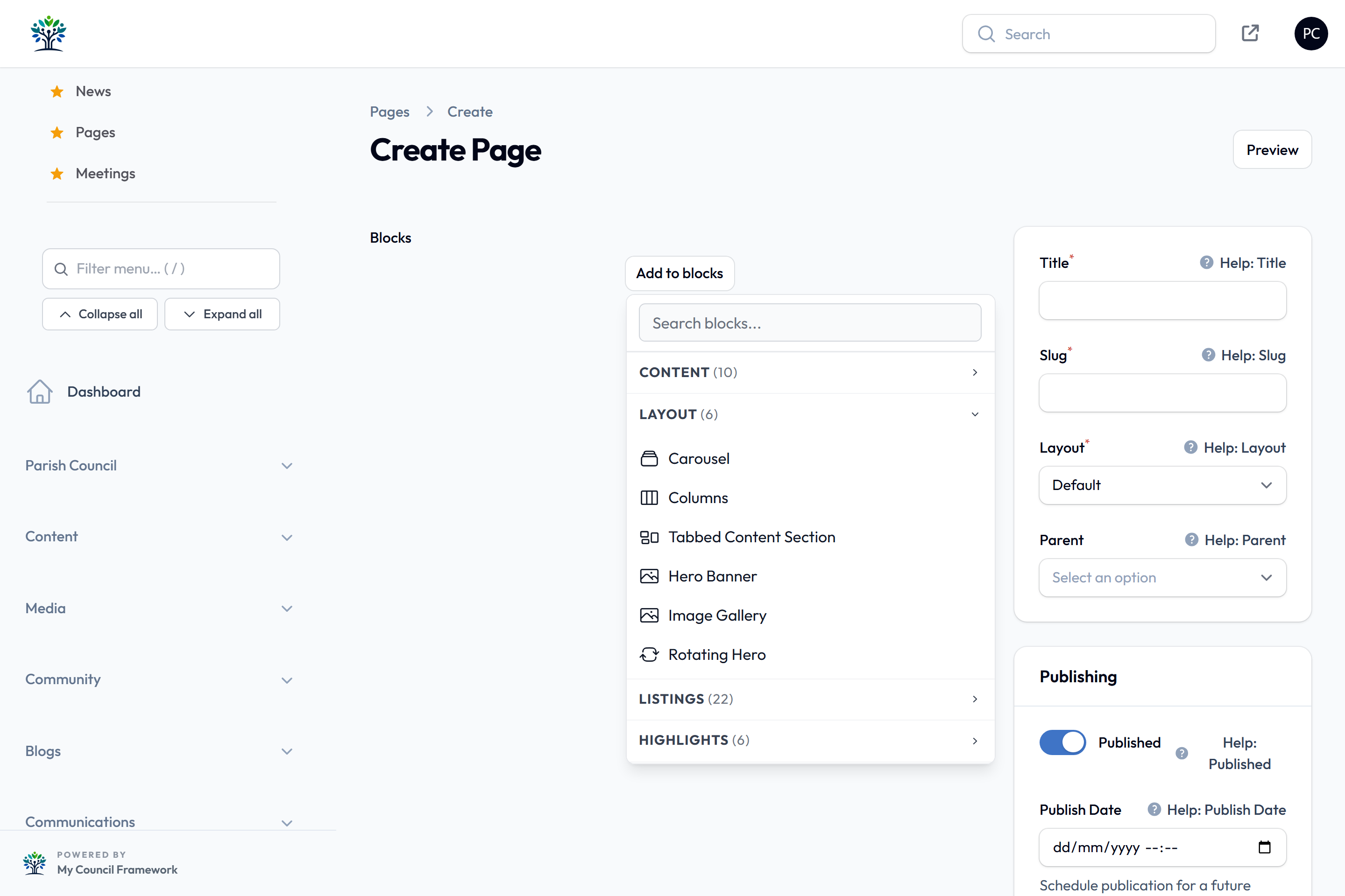
To add a block to a page, see Adding blocks.
The blocks in the Layout category are:
Carousel
A slideshow of pictures that moves on by itself. Each slide can have a heading, a line of text and a button. It pauses while a visitor points at it or uses the keyboard inside it.

Slides
Select Add Slide for each picture. A carousel needs at least one slide. Use the arrows to change their order.
| Setting | What it does |
|---|---|
| Image | Pick the picture from the Media Library. Required. |
| Or enter an image URL | The web address of a picture held elsewhere. The Media Library picture is used if both are set. |
| Heading and Sub-heading | Optional words shown on the slide. |
| Call-to-Action Text and Call-to-Action URL | An optional button. It only appears when you fill in both. The address can be a full one or a page on your site such as /contact. |
Colours & Overlays
This section starts closed. Its settings apply to every slide.
| Setting | What it does |
|---|---|
| Text Colour | The colour of the words and the button outline. White by default. |
| Image Overlay Colour and Image Overlay Opacity | Tints the picture so it doesn't compete with the words. Black at Light (40%) by default. |
| Card Background Colour and Card Background Opacity | A see-through panel directly behind the words. Black at Light (40%) by default. The Contrast check (text on card) badge shows whether the words are easy to read. |
Behaviour
This section also starts closed.
| Setting | What it does |
|---|---|
| Slide Animation | Slide (horizontal), the default, Fade or None (instant). |
| Time Between Slides | From 3 seconds to 10 seconds. 5 seconds is the default. |
| Carousel Height | Small (300px), Medium (450px), the default, Large (600px) or Extra Large (75vh). |
| Auto-play | On by default. Turn it off so slides only change when the visitor chooses. |
| Show Prev/Next Arrows and Show Slide Dots | Both on by default. They only appear when there is more than one slide. |
Columns
Places two, three or four columns side by side. Each column holds its own blocks. On a phone the columns stack one above another.

| Setting | What it does |
|---|---|
| Block title | Optional. A name to help you find this block in the page builder. Visitors don't see it. |
| Number of Columns | 2 columns, 3 columns or 4 columns. The default is 2. |
| Column Widths | Only shown for 2 columns. Choose Equal, the default, or a split such as 33% / 67%. Three or four columns are always equal widths. |
| Gap Between Columns | The space between columns, from Small (0.5rem) to Extra Large (3rem). Medium (1rem) is the default. |
| Vertical Alignment | How shorter columns line up: Top, the default, Middle, Bottom or Stretch (equal height). |
| Column 1 to Column 4 | Add the blocks for each column here. Only as many appear as you chose in Number of Columns. |
A column can hold almost any block, including lists such as News, Events, Notices and Councillors. These blocks can't be added inside a column:
- Columns and Tabbed Content Section (a column can't hold another set of columns or sections)
- Hero Banner, Rotating Hero and Emergency Notice, which are banners across the whole page
- Planning Applications, Virtual Tour, Search and Contact Form, which are built to fill a whole page
Blocks for a feature your council hasn't switched on don't appear, the same as in the main block list. In a narrow column, lists show one item per row with the picture above the text.
If you change from 3 columns to 2, the blocks in Column 3 are hidden from the page. They aren't shown to visitors, but they come back if you switch to 3 columns again. Move anything you want to keep before you reduce the number.
Tabbed Content Section
The tidiest way to present long, multi-part content, such as allotment rules or grant guidance. Each section has its own title and its own blocks. Visitors open one section at a time, or open and close them like an accordion.

| Setting | What it does |
|---|---|
| Heading | A heading for the whole block. |
| Show Heading | Off by default. Turn it on to show the heading above the sections. When it is off, screen readers still get the heading. |
| Start with all sections closed | Off by default. When on, no section opens until the visitor chooses one. Applies to every layout. |
| Layout | Tabs (classic), the default, Tile grid (icon tiles + panel below), List + panel (side by side) or Accordion. The first three show one section at a time. The accordion shows every section closed, ready to open. |
| List position and List width | Only for List + panel (side by side). Put the list on the Left or Right, and choose how wide it is, from 25% (narrow) to 50% (even split). 33% (default) is the default. |
| Sections | Add one section for each topic. Drag them into order. |
Each section
| Setting | What it does |
|---|---|
| Section Title | The wording on the tab, tile or list item. Required. |
| Icon | Optional. A Font Awesome icon name, such as fas fa-users. |
| Tab Colour | Optional. Uses your site's main colour if you leave it blank. |
| Section Content | The blocks shown in this section. A new section starts with an empty Rich Text block. You can add the same blocks as in a column. |
Hero Banner
A large banner across the top of the page. It shows a heading, an optional line of text and an optional button, on a solid colour or a background picture.
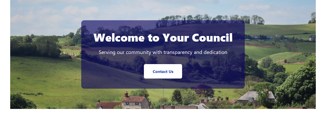
| Setting | What it does |
|---|---|
| Heading | The main words on the banner. Required. |
| Subheading | A shorter line of text under the heading. |
| Show heading & subheading on the banner | On by default. Turn it off when the picture already has words in it. Screen readers and search engines still get the heading. |
Colours
| Setting | What it does |
|---|---|
| Background Colour | The banner colour when there is no background picture. Dark blue by default. |
| Text Colour | The colour of the heading and subheading. White by default. The button uses this colour too. |
| Show Bottom Border | Adds a coloured line along the bottom of the banner. Pick its colour in Border Colour. |
Background Image
This section starts closed. Its settings only take effect when you set a background picture.
| Setting | What it does |
|---|---|
| Background Image and Image alt text | Pick the picture from the Media Library. The alt text fills in from the Media Library. Change it if a different description suits this banner. |
| Or enter an image URL | The web address of a picture held elsewhere. If you also pick a Media Library picture, that one is used. |
| Image Fit | Cover (fill, crop edges) is the default. Contain (fit whole image) shows the whole picture with the background colour behind it. Stretch to fill stretches it to the banner's shape. |
| Image Position | Which part of the picture stays in view, such as Centre, Top or Bottom Left. Choose Custom offset... to type your own value in Custom Position, for example 50% 30%. |
| Image Overlay Opacity | Tints the whole picture with the background colour so the words stand out. Runs from None (no overlay), the default, to Very Strong (85%). |
| Caption Card Colour and Caption Card Opacity | A see-through panel directly behind the words. It is off by default (None (no panel)). Turn it up to make the words easier to read without darkening the whole picture. |
| Caption Card Position | Where the words and button sit on the banner, such as Top left or Middle centre. Middle centre is the default. |
Call to Action
| Setting | What it does |
|---|---|
| Button Text | The words on the button. |
| Button URL | Where the button goes. Use a full address such as https://example.com or a page on your site such as /contact. |
The button only appears when you fill in both Button Text and Button URL.
The Contrast check (text on background) and Contrast check (text on caption card) badges show whether your text colour is easy to read. Pick another colour if a badge doesn't pass.
When a hero banner is the first block on a page, turn off Show Page Title in the page's settings. Otherwise the page title appears above the banner as well. See Page settings.
Image Gallery
A grid of pictures. Visitors can select a picture to see it larger, and move through the others from there.
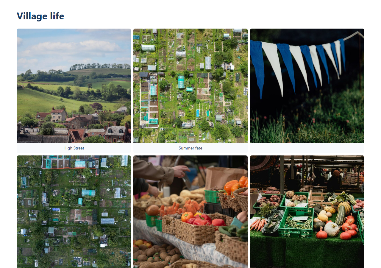
| Setting | What it does |
|---|---|
| Gallery Heading | A heading above the gallery. |
| Show Heading | On by default. When it is off, screen readers still get the heading. |
| Columns | How many pictures across, from 2 columns to 5 columns. 4 columns is the default. |
| Gap Between Images | Small (4px), Medium (8px), the default, or Large (16px). |
| Show Image Titles Below | On by default. Shows each picture's title under it. |
| Gallery Images | Select Add Image for each picture. Each one has an Image, picked from the Media Library and required, and an optional Title / Caption. |
The gallery uses each picture's alt text from the Media Library. If a picture has none, it uses the Title / Caption instead. Add alt text in the Media Library so every picture is described.
Rotating Hero
A hero banner whose picture changes by itself. It looks the same as the Hero Banner. The picture comes from a Media Library folder instead of a single image, so adding a photo to the folder adds it to the banner.
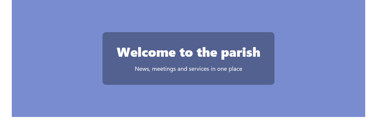
It has the same Heading, Subheading, Colours and Call to Action settings as the Hero Banner. The picture settings are in the Rotating background section.
Rotating background
| Setting | What it does |
|---|---|
| Image folder | The Media Library folder to take pictures from. Every picture in it joins the rotation. Other files in the folder are ignored. Required. |
| Change image | How often the picture changes: On every page load (random), Daily, Weekly or Monthly. Weekly is the default. With daily, weekly or monthly, every visitor sees the same picture for that period. |
| Image Fit, Image Position, overlay and caption card settings | The same as in the Hero Banner's Background Image section. They apply to whichever picture is showing. |
If the folder has no pictures in it, the banner shows the plain Background Colour instead.
To see which image a daily, weekly or monthly banner will show on another date, add
?hero_preview=YYYY-MM-DD to the page address while signed in to the
admin panel. The banner shows that date's image with a "Preview" note. Visitors always
see today's image.