 MCF User Guide
Page Builder
The Page Builder lets you create and lay out website pages by stacking ready-made content blocks, with no code. Add a heading, an image, a row of quick links, then drag them into the order you want and save.
How pages are built
Every page is made of blocks stacked one above another. Each block does one job, such as a banner, a paragraph of text, an image or a set of links. You can add as many as you like and rearrange them at any time.
The main listing pages, such as Councillors, Meetings, News, Events and Policies, are ordinary pages holding one listing block. You can add an introduction or other blocks above or below the list. The individual pages they link to, such as one councillor or one meeting, are built automatically and can't be edited here.
Creating a new page
- Go to Content > Pages and select New Page.
- Enter a Title. The Slug, the end of the page's web address, is filled in for you as you type. You can change it.
- Leave Layout on Default.
- Optionally choose a Parent page (see below).
- Add your blocks (see Adding blocks).
- Check the settings on the right, then select Create.
Published is on for a new page, so it goes live as soon as you select Create. Turn it off first if you want to keep working on the page before anyone can see it.

Choosing a Parent groups pages together in the admin. It doesn't
change the web address: a page with the slug allotment-rules is always at
/allotment-rules, whatever its parent. So each slug can only be used once,
and some are already used by the website itself, such as privacy-policy,
cookie-policy, login and surveys. If you choose
one of these, the form says so when you save; pick a different slug. The privacy and
cookie policy text is edited under Settings > Compliance
& Privacy.
Editing an existing page
- Go to Content > Pages and select Edit on the page's row.
- Make your changes.
- Select Save.
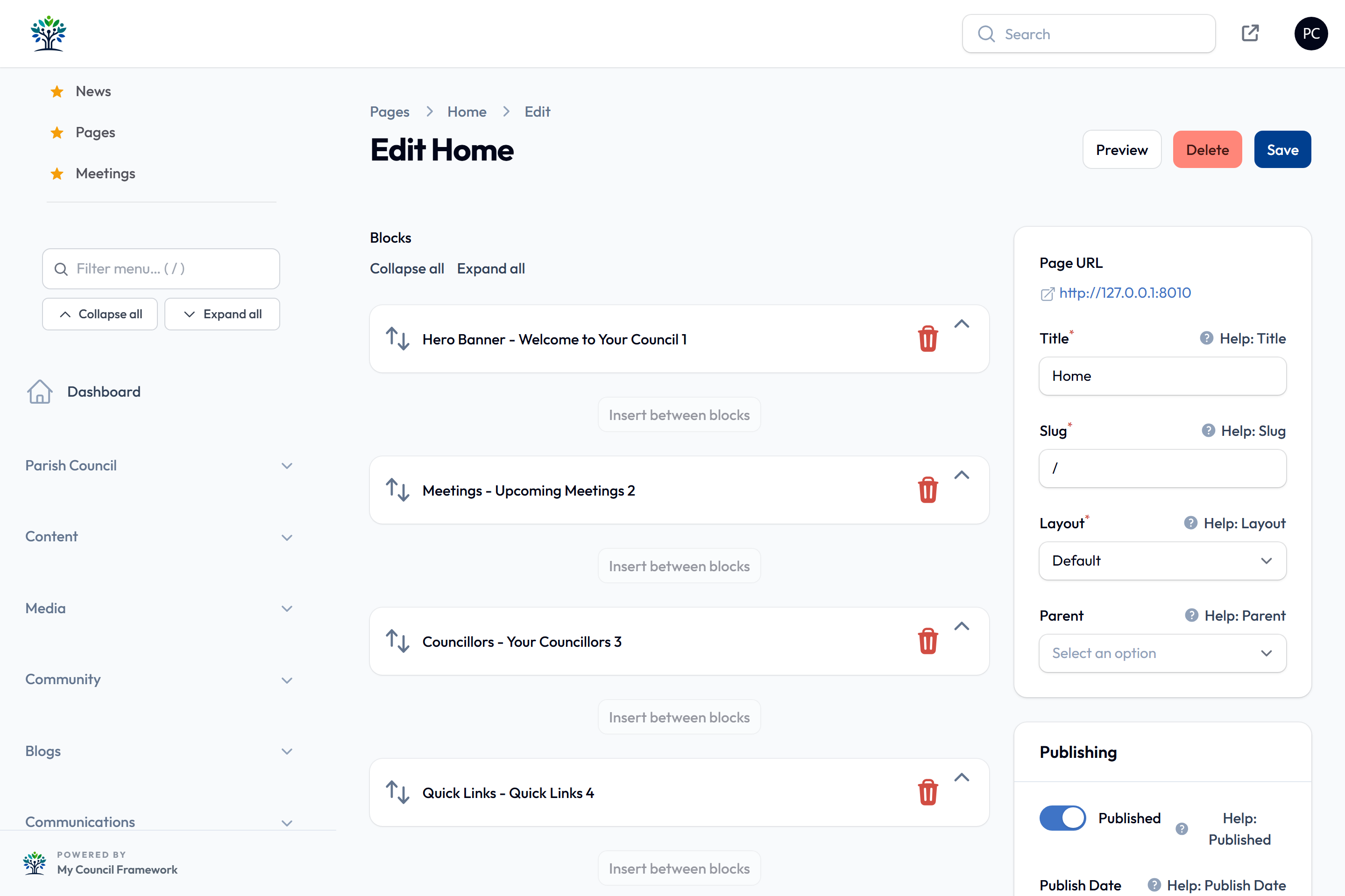
Saving updates the live page straight away; there are no separate drafts. To check your changes first, select Preview at the top of the page, which shows the page as it will look, including changes you haven't saved. It takes a few seconds to appear, and the buttons at the top switch between computer, tablet and phone sizes. View on a page's row, or the Page URL link on the edit screen, opens the live page in a new tab.
Adding blocks
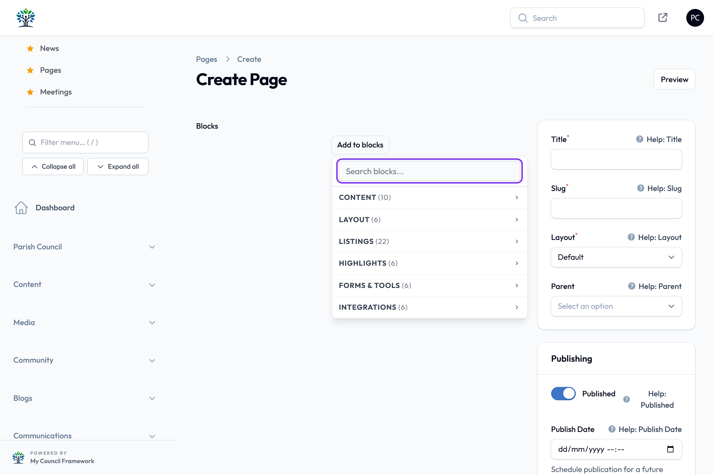
- Select Add to blocks below the last block, or Insert between blocks where you want the new one to go.
- Type in Search blocks..., or open a category and pick a block.
- Fill in the block's settings, such as the text for a Rich Text block or the picture for an Image block.
Arranging and removing blocks
- Move: drag a block by the arrows on the left of its title bar.
- Open or close: select its title, or the arrow on the right. Expand all and Collapse all open or close every block. Blocks close again after you save, to keep long pages tidy.
- Delete: select the bin. Nothing is removed from the website until you select Save.
When you paste into a text editor, from Word, Google Docs or a web page, only the words come across. A note says "Pasted as plain text — formatting from the source was stripped." Then format the text with the editor's own buttons, which keeps pages consistent.
Wherever you choose text and background colours, a badge shows whether they're easy to read: Passes WCAG AA, Large text only or Fails WCAG AA. Pick another colour if it doesn't pass.
All blocks
The picker groups the blocks into six categories. Blocks for features your site doesn't use, such as Petitions or Surveys, only appear once that feature is switched on.
Each category has its own reference page explaining every block's settings: Content, Layout, Listings, Highlights, Forms & Tools and Integrations.
Content
| Block | What it does |
|---|---|
| Rich Text | Formatted text: paragraphs, headings, lists, links, tables and images, with an optional coloured panel. |
| Heading | A section heading with an optional subtitle. |
| Image | A single picture with a caption. |
| Text & Image | A picture beside, above or wrapped by text. |
| Call to Action | A prominent heading, short text and a button, such as "Report a problem". |
| Link Button | A button that opens a document, a page or another website. |
| Link Image | A picture that opens a document, a page or another website. Its Image Size runs from 100px to 800px, or Full Width, so award logos can sit small and a poster can fill the page. |
| Video Player | A YouTube or other online video. |
| HTML Block | Your own HTML or an embed code from another service. |
| Spacer | Empty space between blocks, with an optional dividing line. |
Layout
| Block | What it does |
|---|---|
| Hero Banner | A large banner image with a heading, caption and button. |
| Rotating Hero | A hero banner whose image changes by itself (see below). |
| Columns | Side-by-side columns, each holding its own blocks. |
| Tabbed Content Section | Splits long content into sections, one shown at a time (see below). |
| Carousel | A slideshow of images. |
| Image Gallery | A grid of pictures. |
Listings
These list your records automatically, so you add news, meetings and so on in their own sections and the page keeps itself up to date: Amenities, Blog, Business Directory, Calendar, Councillors, Events, FAQ, Grant Schemes, History, Local Attractions, Meetings, Minutes Archive, News, Notices, Personnel, Policies, Reports & Audits, Resident Issues, Services and Venues. Two more list files from a Media Library folder: Document Browser gives simple download links, and Document Archive groups and filters them by year, month and type.
Highlights
| Block | What it does |
|---|---|
| Quick Links | A grid of link cards to pages, other websites or documents. |
| Next Meeting | Your next upcoming meeting. |
| Next Event | Your next upcoming event. |
| Emergency Notice | Shows your published notices in the Emergency notice category, as an eye-catching warning. |
| Weather | The local weather forecast. |
| UK Parliament Petition | Live progress of a petition on the UK Parliament website. |
Forms & Tools
| Block | What it does |
|---|---|
| Contact Form | A form visitors use to contact the council. |
| Newsletter Signup | A sign-up box for your newsletter. |
| Page Feedback - Was this page helpful? | Yes and No buttons with an optional comment. Results are under Analytics & Audit > Page Feedback. |
| Survey | One of your surveys, for visitors to fill in. |
| Search | A site search box. |
| Interactive Map | A map of your area showing amenities, businesses, events and reported issues. |
Integrations
| Block | What it does |
|---|---|
| Facebook Feed | Recent posts from your Facebook page. |
| FixMyStreet | Recent FixMyStreet reports for your area, with a map and photos. |
| PDF Page Turner | A PDF shown as a flip-through book. |
| Petitions | Your council's own petitions. |
| Planning Applications | Planning applications in your area, with a map and filters. |
| Virtual Tour | An embedded 360° tour. |
Tabbed Content Section
The tidiest way to present long, multi-part content, such as allotment rules or grant guidance. Choose a Layout: Tabs (classic), Tile grid (icon tiles + panel below), List + panel (side by side) or Accordion. Then add a section for each topic, with its own Section Title, optional Icon, and blocks for its content.
The first three layouts show one section at a time; the accordion shows every section closed, ready to open. Turn on Start with all sections closed so nothing opens until the visitor chooses a section.
Rotating Hero
A banner whose image changes by itself. Instead of one picture, choose an Image folder in the Media Library: every image in it joins the rotation, so adding a photo to the folder adds it to the banner. Change image sets how often: On every page load (random), Daily, Weekly or Monthly. It has the same heading, caption, colour and button settings as the Hero Banner.
To see which image a daily, weekly or monthly banner will show on another date, add
?hero_preview=YYYY-MM-DD to the page address while signed in to the
admin panel. The banner shows that date's image with a "Preview" note. Visitors always
see today's image.
Page settings
The panel on the right of the page editor holds the page's settings.
Publishing
- Published on, with no dates: the page is live.
- Publish Date in the future: the page goes live by itself at that time.
- Unpublish Date: the page comes down by itself at that time. Useful for seasonal or time-limited pages.
- Published off: the page is a draft that only admins can see, whatever the dates say.
The Status column in the Pages list shows each page's state: Draft, Scheduled, Published or Expired. Only published pages appear on the website and in the sitemap.
Page title
Also in the Publishing section:
- Show Page Title: show the title as a heading above the blocks. Turn it off when the first block, such as a hero banner, already has a heading.
- Page title style: Use site default, Plain heading or Full-width colour banner. With a banner, extra fields let you set this page's banner colours and padding.
- Page title alignment: left, centre or right.
The site-wide defaults are under Settings > Site Settings, on the Theme & Layout tab.
Theme
- Colour scheme: give this page a different colour scheme from the rest of the site. Leave blank to use the site's.
- Navigation menu: show a different menu on this page, for a self-contained section such as allotments. Leave blank to use the Primary menu. See Menu Builder.
SEO
- Meta Title: the title shown in search results, up to 70 characters. Leave blank to use the page title.
- Meta Description: the summary shown in search results, up to 160 characters. Leave blank to use the site's default.
- OG Image URL: the web address of a picture to show when the page is shared on social media.
- Hide from Search Engines: ask search engines not to list this page.
After saving, select View on the page's row to check it on the live website, especially the order of the blocks and any images.