 MCF User Guide
Forms & Tools blocks
Forms & Tools blocks let visitors do something on your website. They can send the council a message, sign up for your newsletter, rate a page, fill in a survey, search the site or explore a map.

To add a block to a page, see Adding blocks.
The blocks in the Forms & Tools category are:
Contact Form
A form visitors use to send the council a message. They give their name, email address, an optional phone number, a category, a subject and a message. They must also tick a box agreeing to the privacy policy. Beside the form, the block can show your contact details and office hours.

| Setting | What it does |
|---|---|
| Show Contact Information | On by default. Shows your email address, phone number and address beside the form. |
| Show Office Hours | On by default. Adds your office hours under the contact information. |
The email address, phone number, address and office hours are set under Settings > Communications, in the Contact Information and Office Hours sections. The category list is set in the Contact Form Categories section on the same screen.
Every message is stored under Communications > Contact Submissions. See Contact for how to read and manage them.
The office hours sit inside the contact information panel. If you turn off Show Contact Information, the office hours are hidden too, even when Show Office Hours is on.
Interactive Map
A map of your area with coloured pins for amenities, businesses, events and reported issues. Visitors select a pin to see its name and a link to its details. A key under the map shows what each colour means.
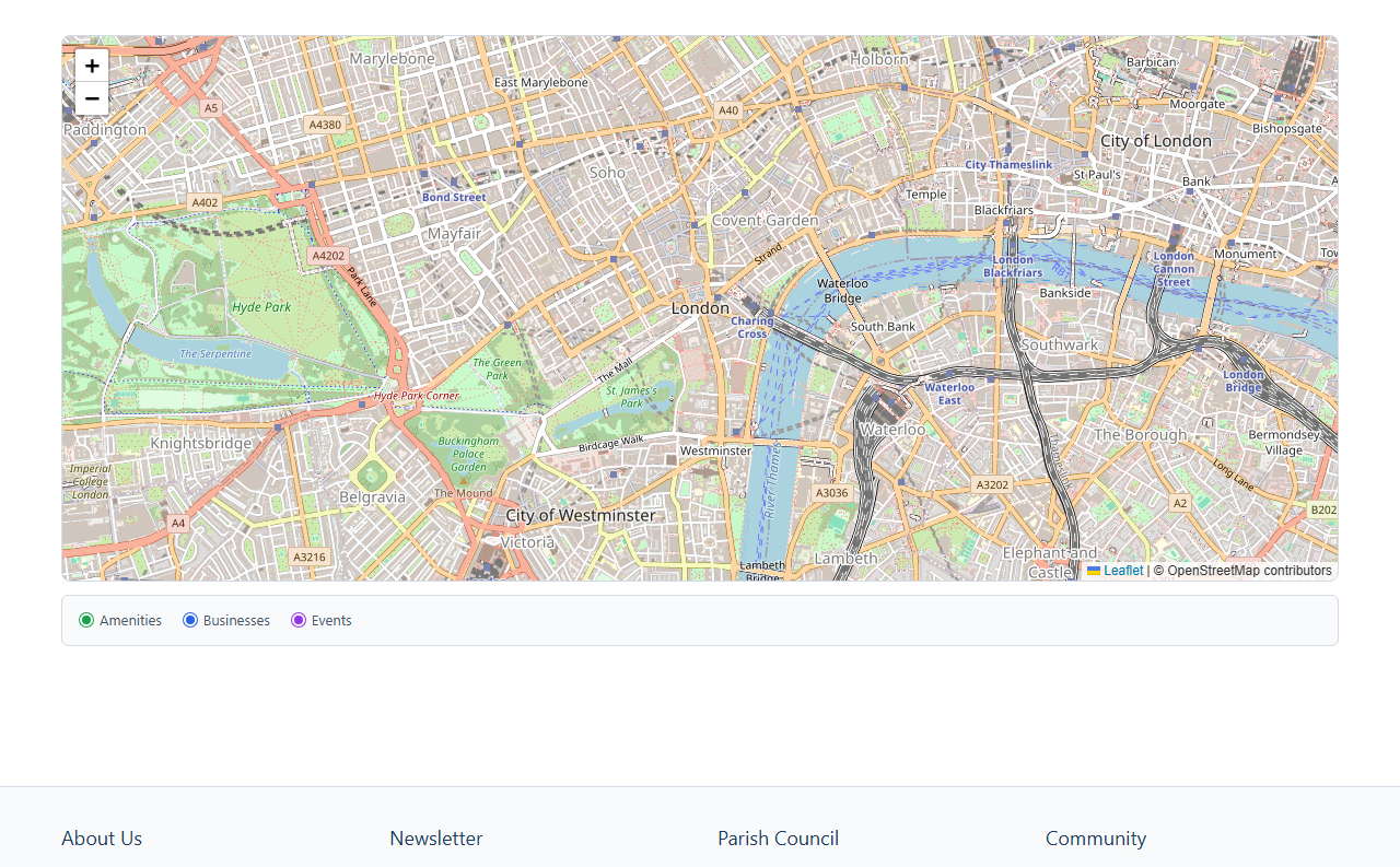
Marker Types
| Setting | What it does |
|---|---|
| Amenities and Amenities Pin Colour | Shows your published amenities. On by default, with green pins. |
| Businesses and Businesses Pin Colour | Shows your published businesses. On by default, with blue pins. |
| Events and Events Pin Colour | Shows your published upcoming events. On by default, with purple pins. |
| Resident Issues and Issues Pin Colour | Shows open reported issues. Off by default. Red pins. |
| Setting | What it does |
|---|---|
| Show Parish Boundary | Off by default. Draws your parish boundary on the map. |
Only items with a map location are shown. The map centres on your parish, and the boundary comes from Settings > Site Settings, on the Location tab.
Reported issues only appear when Resident Issues, Public Issue Visibility and Enable Map View are all switched on under Settings > Modules. Only issues marked as public and still open are shown.
The map comes from OpenStreetMap, another website. Visitors who haven't accepted Marketing cookies first see a message instead of the map. They can select Enable Marketing and view to load it.
Newsletter Signup
A box where visitors enter their email address to subscribe to your newsletter. They are sent an email and must confirm before they are added.

| Setting | What it does |
|---|---|
| Heading | The heading on the box. It starts as "Subscribe to our Newsletter". |
| Description | Optional text under the heading, written in the text editor. |
This block only appears in the picker when Newsletter is switched on under Settings > Modules. Subscribers are listed under Communications > Subscribers. See Newsletter.
The box is hidden while a mourning event is active with Hide promotional blocks (events CTAs, venue ads etc.) turned on. See Mourning.
Page Feedback - Was this page helpful?
Asks visitors whether the page helped them. They answer Yes or No, then can add a comment. Answers are anonymous. Each visitor can answer once per page in a visit.

| Setting | What it does |
|---|---|
| Question | The question visitors see. It starts as "Was this page helpful?". Required. The block's name in the page builder follows this wording. |
| Ask for a comment after the answer | On by default. After answering, the visitor sees a box for an optional comment. |
| Comment prompt | Only shown when comments are on. The wording above the comment box. It starts as "How could we improve this page? (optional)". |
| Thank-you message | Shown once the visitor has answered. It starts as "Thank you for your feedback." |
Answers are listed under Analytics & Audit > Page Feedback. You can see each page's responses and the share of Yes answers. You can delete spam, but you can't edit answers.
The buttons don't work in Preview on a page you haven't saved yet. Save the page and try it on the website instead.
Search
A search box for your whole website, with the results shown on the same page. Visitors can narrow the results by type, such as News, Meetings or Documents. They can also narrow them by date, from Last 30 days to Last year.

This block has no settings. Only types for features your site uses appear as choices. See Navigation & Search for how public search works.
Survey
Shows one of your surveys on the page for visitors to fill in. It can also show the survey's results. When both are available, visitors see a Take Part tab and a Results tab.
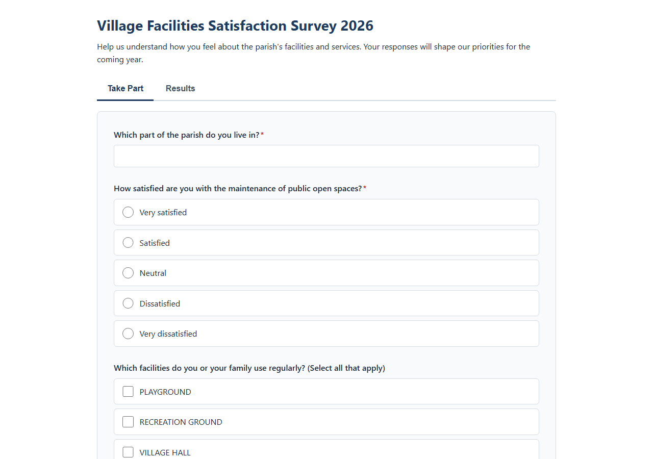
| Setting | What it does |
|---|---|
| Survey | Pick the survey to show. Required. Surveys that aren't published are marked (draft). |
| Show Survey Title | On by default. Shows the survey's title above it. |
| Show Survey Introduction | On by default. Shows the survey's description above the questions. |
The form only shows while the survey is Published and between its Opens at and Closes at times. Results show when the survey has Show results publicly on, or Reveal results after close on and it has closed. Otherwise visitors see a message saying when the survey opens, or that it isn't available. You set all of these on the survey itself, under Community > Surveys.
This block only appears in the picker when Surveys is switched on under Settings > Modules. Responses are listed under Community > Survey Submissions.