 MCF User Guide
Themes & Layout
The Theme & Layout tab lets you set the colours and overall shape of your public website — without touching any code. Pick a ready-made theme or build your own palette, then choose how your navigation and pages are laid out.
Open Settings > Site Settings and select the Theme & Layout tab. Remember to use the Save button on this tab to keep your changes.
Choosing a theme
Your website ships with 25 pre-defined colour themes. Every one of them has been checked against the WCAG 2.2 AA contrast standard, so whichever you choose, your text stays readable for all visitors.
- In the Theme & Layout tab, find the Theme Selection dropdown.
- Pick a theme from the list — for example Classic Blue, Forest Green, Royal Purple or High Contrast.
- A swatch preview shows the theme's colours so you can see the effect before saving.
- Select Save, then visit the public website to see it applied.
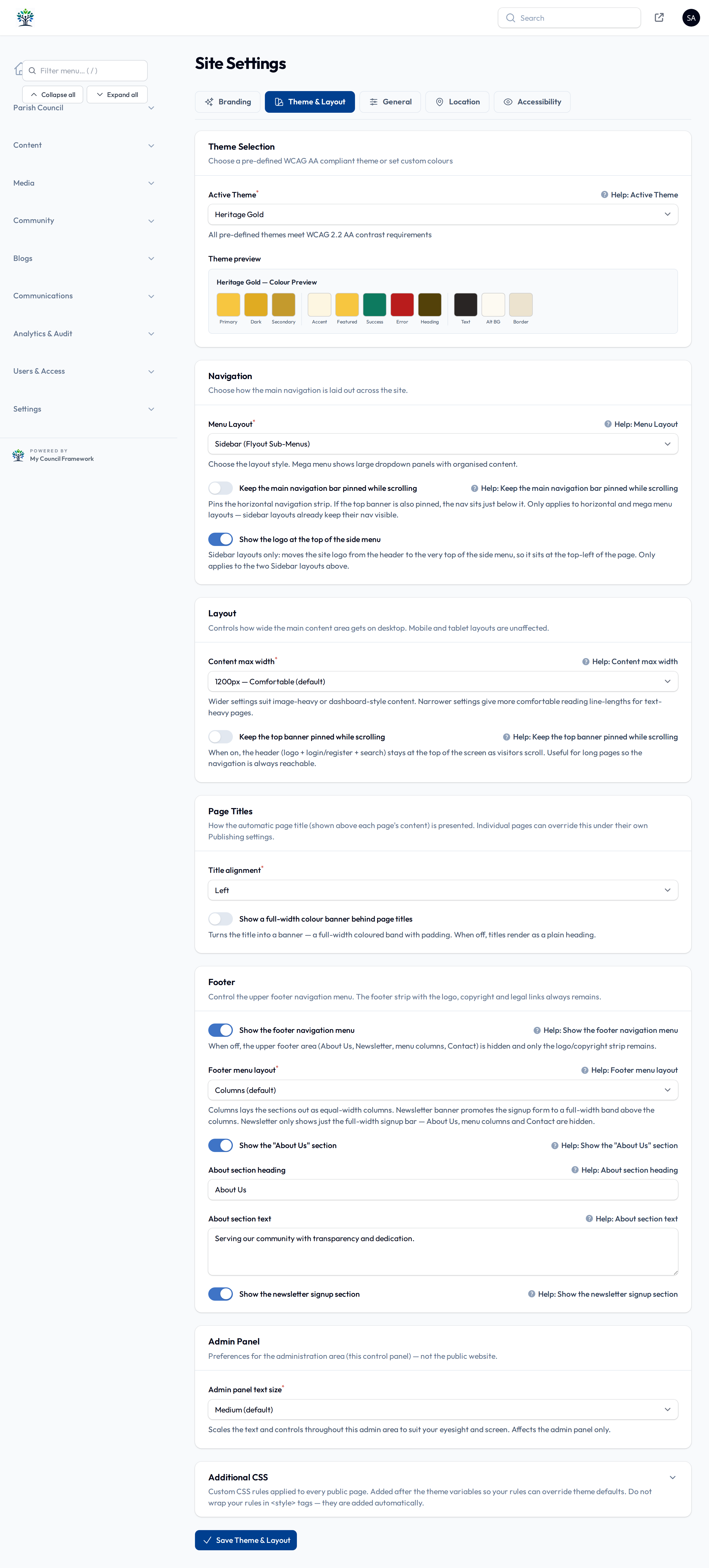
Themes range from calm and traditional (Slate Grey, Navy & Gold, Earth Tones) to bold (Cherry Blossom, Terracotta, Copper). The High Contrast theme is a good choice if accessibility is your top priority.
Light-primary themes (bright colour, dark text)
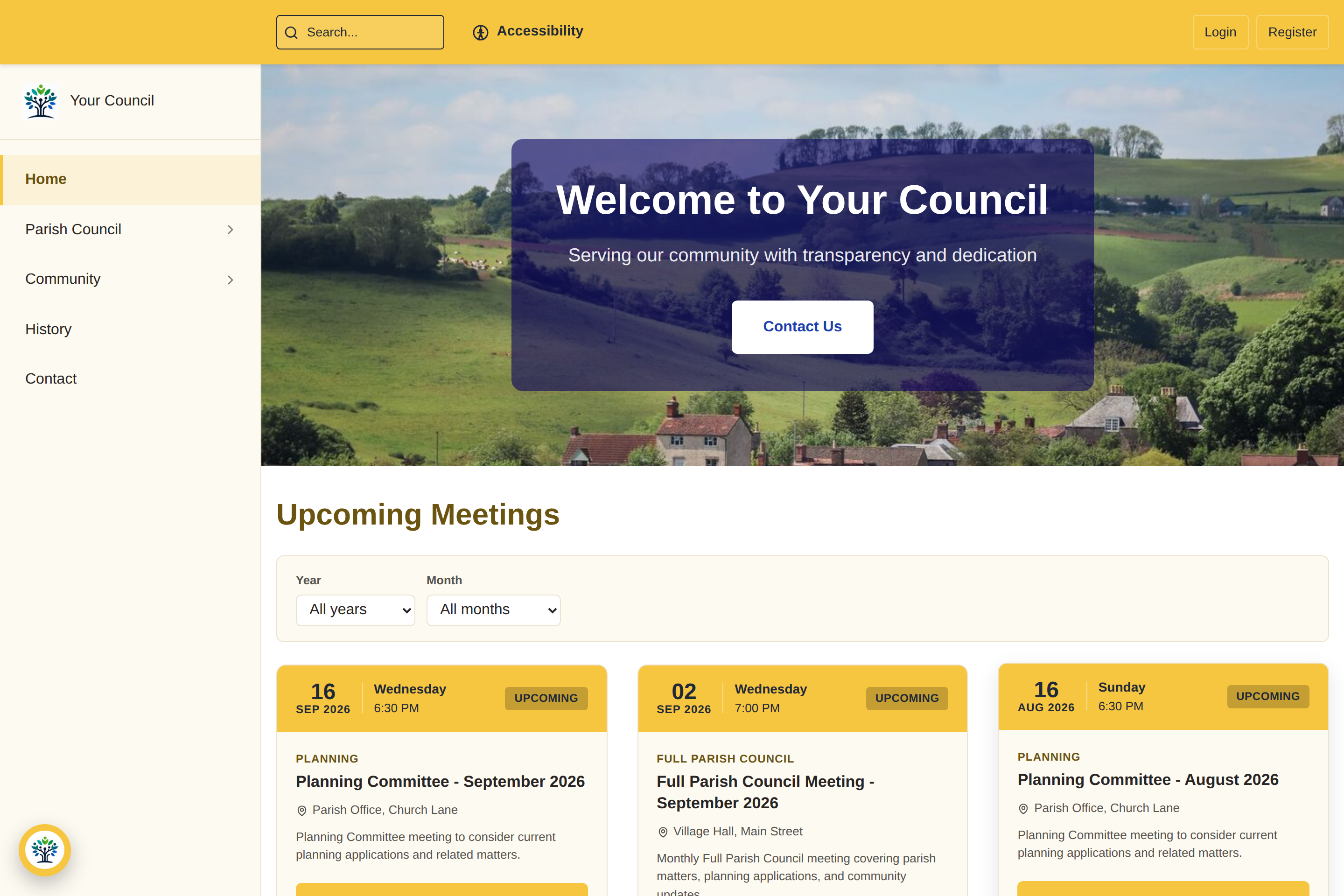
Five of the themes use a bright background colour with dark text on buttons, headers and highlights — a fresh, modern look that still meets the AA contrast standard:
- Heritage Gold — a warm, bright gold (great for councils with a gold or amber brand).
- Sky — a light sky blue.
- Coral — a soft coral/salmon.
- Meadow — a bright lime green.
- Blossom — a gentle pink.
On these themes, buttons and highlighted areas show dark text on the bright colour rather than white — this is deliberate, and keeps everything readable.
Building a custom palette
If none of the built-in themes matches your council's branding, you can set your own colours.
- In the Theme Selection dropdown, choose Custom.
- A set of colour pickers appears. Set your primary, secondary, text, background and accent colours.
- Select Save to apply your custom palette.
The pre-built themes are contrast-checked for you, but a custom palette is your responsibility. Keep a strong contrast between your text and background colours (aim for a 4.5:1 ratio or better) so the site stays accessible and easy to read.
Navigation layout
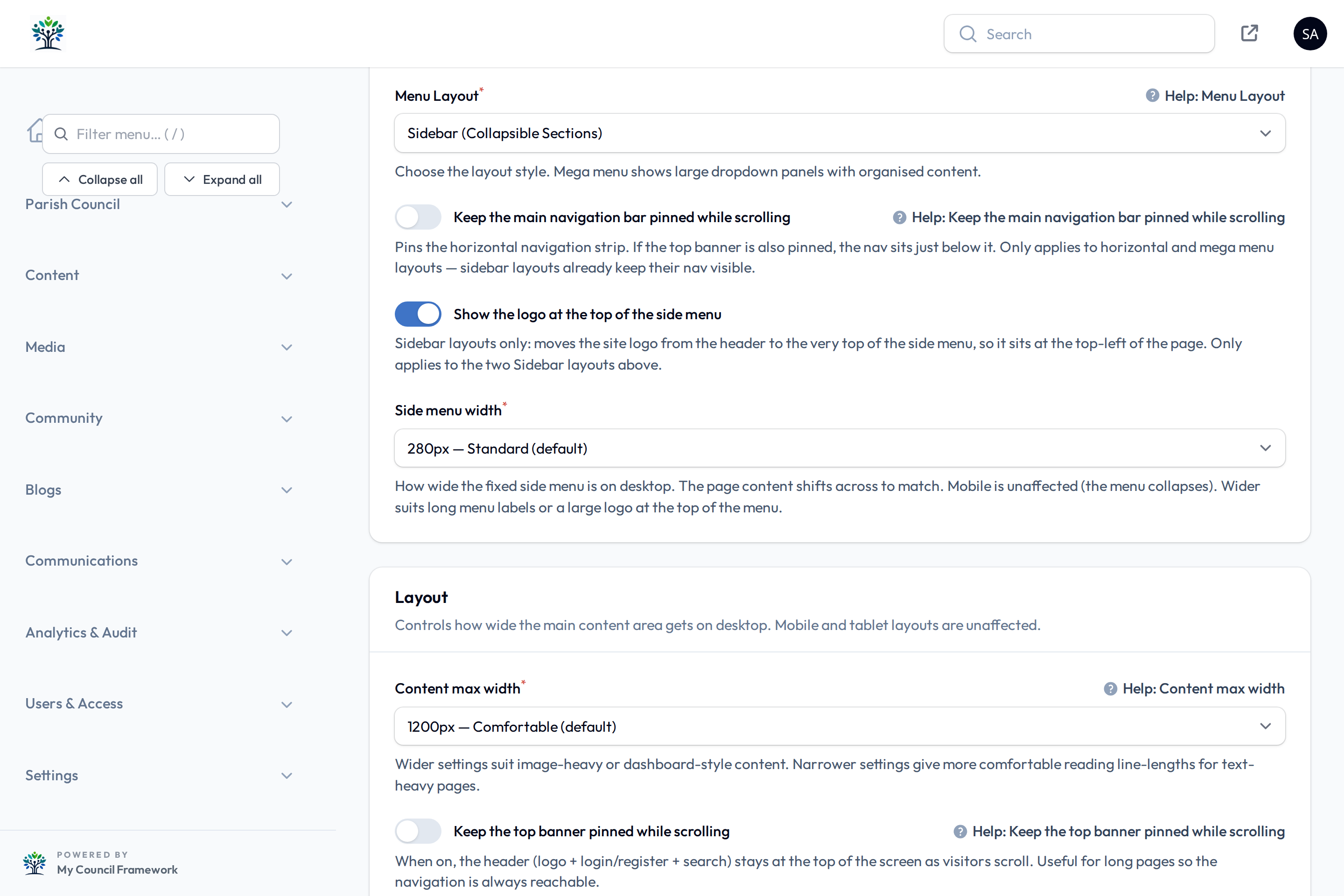
The Navigation section controls how your main menu is presented to visitors. Choose the Menu Layout that suits the size of your site:
| Menu layout | Best for |
|---|---|
| Horizontal | A classic bar across the top — good for most sites. |
| Mega menu | Sites with lots of pages that benefit from grouped drop-downs. |
| Sidebar (collapsible) | A side menu that can be opened and closed. |
| Sidebar (flyout) | A side menu where sub-items slide out. |
You can also pin the navigation so it stays visible as visitors scroll:
- Keep the main navigation bar pinned while scrolling — keeps the menu strip on screen. (Applies to the horizontal and mega-menu layouts; sidebar layouts always stay visible.)
If you use one of the two Sidebar layouts, an extra option appears:
- Side menu width — how wide the side menu is, from 220 to 400 pixels (the default is 280). Pick a wider setting if your menu titles are long and getting cut short; the page content moves across automatically to make room. On phones this setting has no effect — the menu collapses into the usual tap-to-open mobile menu.
Page layout
The Layout section controls the width of your content and the behaviour of the top banner:
- Content max width — how wide your pages can grow on large screens: 1200, 1280, 1440 or 1536 pixels.
- Keep the top banner pinned while scrolling — pins the header (logo, login/register and search) at the top of the screen as visitors scroll down.
The Footer section in this tab lets you choose how the footer menu area is arranged — a columns layout, a newsletter banner, or a newsletter-only band — and edit the "About Us" heading and text. The bottom strip (logo, social links and copyright) always shows. The newsletter sign-up form only appears while the Newsletter module is switched on under Settings > Modules — see Newsletter.
Page titles
The Page Titles section controls how the title at the top of each page is presented across your whole site:
- Title alignment — align page titles to the left, centre or right.
- Show a full-width colour banner behind page titles — turn this on to give each page a coloured title band (using your theme colour); leave it off for a plain heading on a white background.
These are the site-wide defaults. An individual page can override the alignment and banner from its own settings in the Page Builder, so a special landing page can look different from the rest of the site.
Admin panel text size
The Admin Panel section sets the text size used inside the administration screens — Small, Medium or Large. This only affects what you and your fellow administrators see when logged in; it does not change the public website. Pick the size that is most comfortable to read on your screen.
Additional CSS
For councils that need fine-grained tweaks, the Additional CSS box lets you add plain CSS rules that are applied to every public page. Most councils never need this — the theme and layout options above cover the great majority of cases. Only use it if you are comfortable writing CSS, and test your changes on the public site afterwards.